
Aspen Play Design System
Shared foundations and components for Aspen Play.
Native web components, four async loader designs and a shared SVG icon library using the Graphite theme. Available here; migration across game pages and Figma synchronization are still pending.
File structure
| File | Responsibility |
|---|---|
tokens.css | Color, spacing, type, size and motion tokens. |
components.css | Reusable ap-* component styles, independent of the documentation layout. |
components.js | Shared switch, segmented control, dialog and toast behavior. |
icons.js | Shared SVG artwork and accessible icon rendering. |
page.css / page.js | Documentation layout, source display, search and preview controls only. |
Quick start
Color tokensColors
Semantic tokens inherit existing product values, with standalone defaults.
| Token | Usage | Convention |
|---|---|---|
--ap-color-page | Page background | Defaults to #181818; inherits --paper. |
--ap-color-text | Body text and headings | Primary content. Keep it legible across states. |
--ap-color-muted | Supporting text | Descriptions, hints and secondary labels. |
--ap-color-action | Actions and focus | Keyboard focus and selected controls. |
--ap-color-error | Input errors | Always pair color with a clear text message. |
Token source
Icon library
Familiar strokes. Made for play.
TypographyTypography
Geist for interface and display type. Geist Mono for room codes, clocks and code. System fonts cover other scripts.
--ap-type-display44px
Play awhile.
--ap-type-heading28px
Make room for play.
--ap-type-body16px
A little time to play, alone or together.
--ap-type-label12px
Ready · Waiting for another player
- Family
- Geist · Geist Mono
- Designer
- Basement Studio (Andrés Briganti, Mateo Zaragoza) for Vercel
- License
- SIL Open Font License 1.1 · © 2024 The Geist Project Authors
- Format
- WOFF2, variable, self-hosted
- Axis
- Weight 100–900. Mono is a second file, not an axis.
- Not included
- Italic · oldstyle figures
- Scripts
- Latin, Latin Extended, Cyrillic. Chinese falls back to PingFang SC, then Microsoft YaHei.
- Tokens
- --ap-font-sans · --ap-font-mono · --ap-type-display / heading / body / label
Geist and Geist Mono, variable 100–900, served from this site under the SIL Open Font License. Use 1.7 line height for body text and 1.4–1.5 for controls. Inputs use 16px text. There is no italic; do not synthesize one.
Space & surfacesSpacing & surfaces
Solid fills only. Use spacing and subtle shadows for depth; never use color gradients on components or canvas surfaces.
- Space
- A 4px unit: 4 · 8 · 12 · 16 · 24 · 32 · 48px
- Radius
- control 9 · input 14 · button 12 / 14 / 18 · square 4 · pill 999 · card 16 · dialog 22
- Heights
- 36 · 44 · 52px. 44 is the minimum target.
- Surfaces
- page #181818 · inset #202020 · raised #242424 · card #252525 · control #292929 · input #2b2b2b · input focus #303030 · action #c3c3c3. The input error tint is in tokens.css.
- Shadows
- raised · inset · overlay · button
- Tokens
- --ap-space-* · --ap-radius-* · --ap-size-* · --ap-surface-* · --ap-shadow-* · --ap-color-page / inset / control / line
Solid fills only. Tone places a surface; a soft shadow and a one-pixel highlight give it depth. Space is a 4px unit; rows part with a 2px seam, never a line.
InputInput
Keep labels visible and errors specific. The application owns validation.
Live example
Properties & states
| Property | Purpose |
|---|---|
.ap-input-shell | Wrap the input with optional icons, prefixes, suffixes and actions. |
data-size | sm / md / lg. Small fields use a 44px minimum on touch pointers. |
data-ap-clear / data-ap-reveal | Optional clear and password controls, initialized with initInputs(). |
data-ap-counter | Shows the value length against native maxlength, using the same UTF-16 counting convention. |
aria-invalid="true" | Error treatment; update the hint at the same time. |
aria-describedby | Reference the unique ID of the hint element. |
disabled / readonly | Disabled / focusable but read-only. Choose based on the use case. |
.ap-hint[data-error="true"] | Update the hint together with the input’s aria-invalid state. |
Usage
- A placeholder does not replace a label.
- Clear stale errors on input and validate the full value on submit.
- The ds-* classes only arrange this preview. Use ap-field and ap-input independently.
Keyboard & accessibility
- Match the label’s for attribute to the input’s ID.
- Return focus to invalid input and announce the hint with aria-live.
- This preview never sends the code or changes account data.
SwitchSwitch
Toggle a binary setting. Read aria-checked or listen for ap:change.
Live example
Properties & states
| Property | Values / defaults | Behavior |
|---|---|---|
role="switch" + aria-checked | true / false Required | true is on; false is off. The application sets the initial value from its stored setting. |
aria-labelledby / aria-label | Accessible name | Names the setting, not the action: “Sound effects”, never “Turn on sound”. The name stays the same in both states. |
data-form | pill / slim / rocker / flip / segment / chip / tile / text Default: pill | The shape. Every form is the same button with role="switch" and aria-checked; only the inner markup differs. See the palette for each form’s markup. |
data-hold | Milliseconds, e.g. 600 | Hold to switch: pointer or Space/Enter starts, the track fills for the duration, releasing early cancels. A plain click never changes it. For settings with no undo. |
data-drag | Boolean attribute (pill and slim) | The thumb follows the pointer and settles on the nearer state. A short press still toggles. |
data-variant | accent / danger Default: neutral | Changes only the on-state fill. Accent for the one setting that matters most on a screen; danger for a setting that exposes or removes something. |
data-marks | icons / labels | icons shows a glyph in the thumb through .ap-switch__mark[data-mark]; labels shows a word in the track through .ap-switch__text[data-state] and widens it. Both are decorative: the state is aria-checked. |
.ap-switch-options | Two named sides[data-side="off"], [data-side="on"] | Neither state fills. Clicking a name selects that side. For more than two options, use Segmented. |
data-size | sm / md / lg Default: md | Track 34 × 20 / 42 × 24 / 52 × 30px. The hit area is at least 44px tall in every size. |
.ap-switch-field | Name, optional description, switchdata-layout="trailing" | A setting row. Clicking the text toggles the switch. Link a description with aria-describedby. |
.ap-switch-list | One setting row per item | Related settings under one heading. Use role="group" and aria-labelledby on the list. |
aria-busy | true while saving | The switch keeps its new state and ignores further toggles until the application removes the attribute. On failure, restore aria-checked and explain in a status region. |
disabled | Native boolean attribute | Prevents interaction and change events, and removes the control from tab order. |
ap:change | event.detail.checked | A boolean, dispatched after aria-checked changes. The application persists the setting. |
Usage
- Use for settings that take effect immediately. For choices collected by a form, use a checkbox.
- Pill is the default. Rocker and flip when the setting should feel physical, as in a game’s options panel. Chip and tile when it sits among several on a board. Segment when both states need a name. Text when there is no room for anything else.
- Confirm before a change that exposes something; hold for a change with no undo; offer undo when the change is easy to make by mistake.
- The application owns persistence. While it saves, set aria-busy; if saving fails, restore the previous state and say why.
- This preview toggles state without playing sound.
Keyboard & accessibility
- Tab to focus; Space or Enter to toggle.
- The focus ring uses --ap-color-action with a 3px offset, outside the track.
- Reduced motion removes the thumb travel and the saving pulse. State stays readable from the track fill.
SegmentedSegmented control
Choose one option from a mutually exclusive group. This is not a tab panel.
Live example
Properties & states
| Property | Values / defaults | Behavior |
|---|---|---|
role="group" + a name | aria-label or aria-labelledby Required | Names the choice, not an option: “Game mode”. This is a group of buttons, not a tablist; it never controls a panel. |
aria-pressed | true on exactly one enabled option | The application sets the initial choice. If none is set, the first enabled option is chosen without an event. |
data-value | Application value per option | Reported by ap:change. Keep it stable; the label may be translated. |
data-form | raised / slider / underline / pills / icons / stack / steps / joined Default: raised | The shape. Every form is the same group of buttons; slider needs equal widths, icons needs an aria-label per option, stack takes a title and a hint per option. |
data-variant | accent Default: neutral | Changes only the fill of the chosen option, in every form. |
data-size | sm / md / lg Default: md | Option height 36 / 44 / 52px. The trough adds 4px around. |
data-fit / data-wrap | content / boolean | Options share the width by default. data-fit="content" sizes each to its label; data-wrap lets a long set break onto more lines. |
.ap-segmented__count | A number inside an option | How many items the option filters to. Keep it current. |
data-preview | Boolean attribute | Emits ap:preview with the option under the pointer or focus, and again with the chosen value when it leaves. The application shows the preview without committing. |
data-drag | Boolean attribute | Sweep: with the pointer down, the choice follows it across the options; one ap:change on release, none if it ends where it started. |
aria-busy | true while saving | The group keeps its new choice and ignores further changes until the application removes the attribute. On failure, restore aria-pressed and explain in a status region. |
disabled | Per option | Skipped by arrow keys and sweeps. Disable every option to disable the group; keep the chosen one visible. |
ap:change | event.detail.value | Dispatched on the group after the choice changes. Choosing the current option again is not a change. |
Usage
- Two to five short options that all fit on one line. For more, or for long labels, use a select or a stack.
- Raised in a form, underline in a header, pills in a filter bar, icons in a toolbar, stack when each option needs a sentence, steps for a scale, joined beside other controls.
- Preview when the choice is visual and cheap to show; confirm before an option that exposes something; undo when the change is easy to make by mistake.
- Initialize new groups after rendering. Do not replace the children of an initialized group.
Keyboard & accessibility
- Tab enters the chosen option; arrow keys move the choice through the enabled options, in either axis.
- Home / End choose the first / last enabled option.
- The focus ring uses --ap-color-action outside the option. Reduced motion removes the glide and the saving pulse; the choice stays readable from its fill.
Game cardGame card
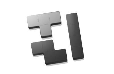
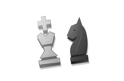
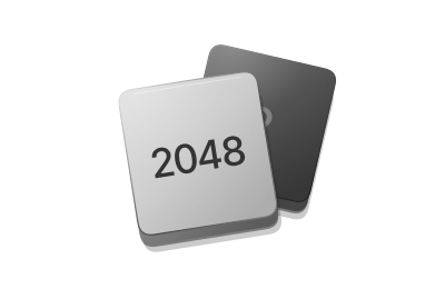
The entire card links to its game; the title provides its accessible name.
Live example
| Structure | Responsibility |
|---|---|
a.ap-card | Provide a real href. The whole card is focusable and clickable. |
.ap-card__art | Decorative artwork keeps its aspect ratio inside a solid portrait cover. Hover gives it a small lift and rotation. |
.ap-card__title | Game name below the cover; long titles can wrap. Genre and player mode provide quiet context. |
Usage
- Do not nest buttons or additional links inside the card.
- The consuming page owns the grid and column count.
- Solid portrait covers, separate captions and a contextual launch cue. The artwork carries the identity; never add gradient fills or decorative borders. Legacy game pages have not been migrated.
Keyboard & accessibility
- Tab to focus; Enter to navigate.
- Use empty alt text when the title already describes the destination.
Loaders
A little anticipation. A clear arrival.
Live example
Options
| Option | Default | Purpose |
|---|---|---|
variant | tiles | tiles · orbit · pulse · word · line · skeleton · reveal · converge · scan · satellite · helix · ripple · pendulum · comet |
size / speed | md / normal | Token-based sizes and motion pacing. Reveal fills its parent, up to 300px. |
label | Loading | Accessible pending status. For word, the label is also the mark. |
delay | 160 ms | Skip the visual animation for short tasks. |
minDuration | 320 ms | Once visible, hold briefly to prevent a flash. 320 covers the 240 ms entrance and a 70 ms press. |
layout | stack | stack · inline · bare. Bare clips the label visually; it is still announced. |
placement | flow | flow · top. Line only: two pixels on the top edge of the host, which keeps showing its content. Forces bare. |
shape / lines | text / 3 | Skeleton only. text · row · card · list, and one to six lines. |
showValue | false | Adds a percentage beside the mark. Hidden until progress is measured. |
handoff | stay · swap for reveal and skeleton | stay: tiles fill, the ring closes, dots settle. swap: the content takes the place of the mark. check: a drawn check or alert, ignored at sm. |
tone | default | default · quiet. Quiet is for a background refresh. |
escalate | false | true acknowledges the wait in words at 4 s and 10 s. Or pass [{ after, label, cancel }]. It never changes tempo. |
idleLabel / successLabel / errorLabel / cancelLabel | Ready / Ready / Could not load. Try again. / Cancelled | The words for each terminal state. |
Methods & events
| Method or event | Returns / detail | Behavior |
|---|---|---|
run(task) | Promise | task receives { signal, report }. Resolves to success + value, error + error, or cancelled. It never throws for a failed task. |
retry() | Promise | Runs the last task again with a fresh AbortSignal and counts the attempt. Rejects with TypeError before any run. |
setLabel(text) | — | Writes the status once; identical text is skipped. For word it rebuilds the letters. |
setProgress(value) | null | Only pass measured progress from 0 to 1. The native meter takes it at once; the visual eases. null hides the meter and the percentage. |
cancel / reset / destroy | Methods | Abort a run, return to idle, or restore original content and clean up. |
state | idle · pending · success · error · cancelled | The current state, read-only. |
ap:loadstate | { state, previous, attempt, elapsed, shown } | idle → pending → success / error / cancelled. Starting again supersedes the previous run. |
ap:loadvisible | { elapsed } | Fires when the delay has passed and the mark appears. A fast task never fires it. Show an application Cancel button here. |
ap:loadwait | { step, elapsed, label, cancel } | One per escalation step. cancel: true is the moment to offer a way out. |
data-state / data-visible / data-shown / data-measured / data-wait | Host attributes | Style hooks. Set data-offscreen yourself to pause a loop that cannot be seen. |
Usage
- Bind a loader to a task, never to a timer.
- Under 160 ms show nothing. Under 1 s prefer Orbit or Word.
- A known shape: Skeleton. Artwork arriving: Reveal. A region: Line. People: Pulse. The app or a room: Tiles, one per view.
- Measured: Orbit or Line. Never trickle: a bar moves only when something was counted.
- Escalate in words about time. Never say almost.
- Errors say what to do next. Optimistic only when rollback is cheap.
Keyboard & accessibility
- The host is aria-busy while pending. One polite status region speaks on a state change or an escalation step: at most four times a run.
- The mark is aria-hidden. The native progress element stays in the accessibility tree; the visible percentage does not.
- Content is inert until success. After Retry or Cancel, focus returns to the trigger.
- Reduced motion swaps every loop for a still pose, a glyph and the same words.
- Nothing changes brightness faster than the 1200 ms beat. One Motion switch pauses every preview on this page.
Integration
Load tokens.css and components.css, then import createLoader from loader.js. Give each instance its own host. A reveal or skeleton host contains the content that becomes visible when the task succeeds.
Pass fetch the supplied AbortSignal. For images, await image.decode() inside the task before completing. Retry with retry(). Check the returned status; errors are returned, not thrown. Call destroy when removing the component. Cancel and Retry buttons, optimistic updates and rollback belong to your application.
Motion follows prefers-reduced-motion. Status is announced politely; the host is marked aria-busy while pending. No percentage is invented, and no task is assumed complete because time elapsed.
Design reference
Inspired by Rare UI · Grid Reveal ↗: a focused stage, optional implementation details, and waiting that resolves into content. This is an independent native HTML/CSS/JavaScript implementation. Reveal uses a quiet fixed mosaic, rather than the reference’s adaptive image subdivision.
Voice
Listening, thinking, speaking. A presence for every conversation.
Voice Agent and Voice Dictation. Ten orb styles, waveforms and a state-by-state instrument.
Voice loader
| Voice loader | Values / defaults | Behavior |
|---|---|---|
createVoiceLoader(host, options) | form: bars · orb · wave · matrix · speaker · button size: sm · md · lg | Six bodies for one state machine. Level-reactive forms draw on one canvas; speaker and button are DOM. |
orbStyle | presence (default) · halo · ripple · bloom · eclipse · contour · silk · orbitals · swarm · ribbon | For form: orb. All styles share the same states, smoothed levels, reduced motion and lifecycle. |
setState(next, { label, reason }) | idle · connecting · listening · thinking · speaking · success · error · muted · denied | Any known state, in any order: agent events do not queue politely. Unknown names throw RangeError. success returns to idle after 1500 ms; error after 2400 ms, and its words stay. |
setLevel(value, channel) | 0 to 1 · input / output | Call it at any rate. It is sampled every 30 ms and smoothed twice: 40 ms attack, 240 ms release, a 35 ms polish. |
attachStream / attachAnalyser / simulate / detach | MediaStream · AnalyserNode · seeded voice | attachStream never stops your tracks; the application opens the microphone. simulate is a seeded voice, the same every time. |
run(task, map) | Promise | Processing is a pending task: thinking appears after 160 ms, stays at least 320 ms, then success, error or idle. The same three results as createLoader. |
show / hide / pause / resume / seek / destroy | Methods | Presence, playback and cleanup. A loader at rest, off screen, in a hidden tab or under reduced motion draws no frames. |
mode / align / press / seed / sensitivity / label / announce | static · scroll / center · bottom / toggle · hold / 7 / 1 / visible · hidden / true | Per-form options. label: hidden clips the state word; it is still announced. |
ap:voicestate | { state, previous, reason } | One per state change. There are no per-frame events. |
ap:voicepress | { pressed, source } | From the mic button, in toggle or hold mode. The application opens the microphone in answer. |
Integration
Import createVoiceLoader from voice.js. Your application owns the microphone and passes its stream to attachStream. Open it only from a user gesture. Detach and stop the tracks when leaving the conversation.
The component never records or sends audio. This gallery uses simulated input unless you choose Use microphone.
Usage
One voice form per surface. The state is always readable as a word. Open the microphone only from a user gesture; stop your tracks when leaving.
Keyboard & accessibility
Space and Enter operate the mic; Escape cancels a hold. Reduced motion keeps a still pose and the same words. Motion pauses previews; leaving this page releases its microphone.
Voice guidance & reference
For voice, import createVoiceLoader from voice.js. Your application calls getUserMedia from a user gesture and hands the stream to attachStream. Map NotAllowedError to setState('denied') and a user mute to setState('muted'). The loader never opens, records or sends audio, and never stops your tracks.
Voice family: informed by the design language of ElevenLabs UI ↗ (MIT): an agent state machine, smoothed levels, morphing states. An independent vanilla implementation in solid monochrome shapes; no code was copied.
ToastToast
Confirm lightweight actions. Keep persistent errors inline.
Live example
| API | Convention |
|---|---|
showToast(message, options) | Accepts plain text, never HTML. |
options.duration | Defaults to 4000ms. A new message replaces the old one and restarts the timer. |
Usage
- Use for short messages without actions. Keep important information visible elsewhere.
- Do not place undo or confirm actions inside an auto-dismissed message.
Keyboard & accessibility
- Uses role=status and aria-live=polite without moving focus.
- Clears text when dismissed, leaving no stale hidden message.
DialogDialog
Use when a decision is required. Focus the safe action first.
Live example
| Properties / API | Convention |
|---|---|
data-ap-dialog | Match the target dialog’s unique ID. |
showModal() | Native modal presentation makes the background inert. |
dialog.returnValue | Read the submitted button value. Restart only for an explicit restart result. |
close | Listen for close and handle the result in application code. |
Usage
- Use a unique ID for every instance.
- Use inline feedback for routine messages and label actions by their outcome.
- Closing is separate from submitting. Dismissal is not confirmation.
Keyboard & accessibility
- autofocus selects “Keep playing” when opened.
- Escape dismisses; Tab stays within the modal.
- Closing restores focus to the trigger.
Guidance
The language behind the interface.
IntegrationContributing
Update the design rules and component source together.
| Step | Action |
|---|---|
| Update foundations | Edit tokens.css. Name tokens by purpose and retain compatibility with product variables. |
| Update components | Edit the component section in components.css. Do not override its appearance in page.css. |
| Sync documentation | Run npm run prepare:design-docs. dev and build run it automatically; check detects stale documentation. |
| Verify changes | Check default, focus, pressed, disabled, loading, long text, narrow layouts and reduced motion. |
| Migrate product pages | Replace legacy styles with ap-* one page at a time and verify the result. |
Component contract
ap-*classes are reusable components;ds-*classes belong to the documentation layout.- Express state with standard attributes. JavaScript does not directly set colors, spacing or sizes.
- Components own UI behavior. The application owns authentication, game state, requests and storage.
- Ship HTML, CSS, behavior, properties and usage guidance with every new component.
Independent CSS and JavaScript for seven components, with source-generated documentation. Full product migration and an accessibility audit remain pending.